
Personifying Li’s culture to their website
TIMELINE
February - July 2023
PLATFORM
Responsive Website
MY ROLE
Researcher, Product Designer, Web Developer
Introduction
Li is a modern Malaysian restaurant that has been open since 2015. Li looks to bring Malaysian produce and culture into the future in a casual and innovative way while respecting the past. Their restaurant features many family friendly dishes to share as well as eclectic drinks curated by their members of the team.
My Role
I was in charge of the whole process in this project, which were Research, Design and Development of the redesigned website.
Project Overview
Li wants to update their website to make it more attractive and aesthetic to customers visiting the page.
Key Deliverables:
Wireframes
3 Interactive mockups
Figma prototype for mobile and web
Front-end developed prototype
Problem
The landing page doesn’t have a clear purpose
At first glance Li’s website doesn’t indicate that it is a restaurant website as there is no sign or image of food on the landing page. The landing page contains an outline of their store and words about the restaurant which doesn’t draw users to click further or get information about the main product which is food.
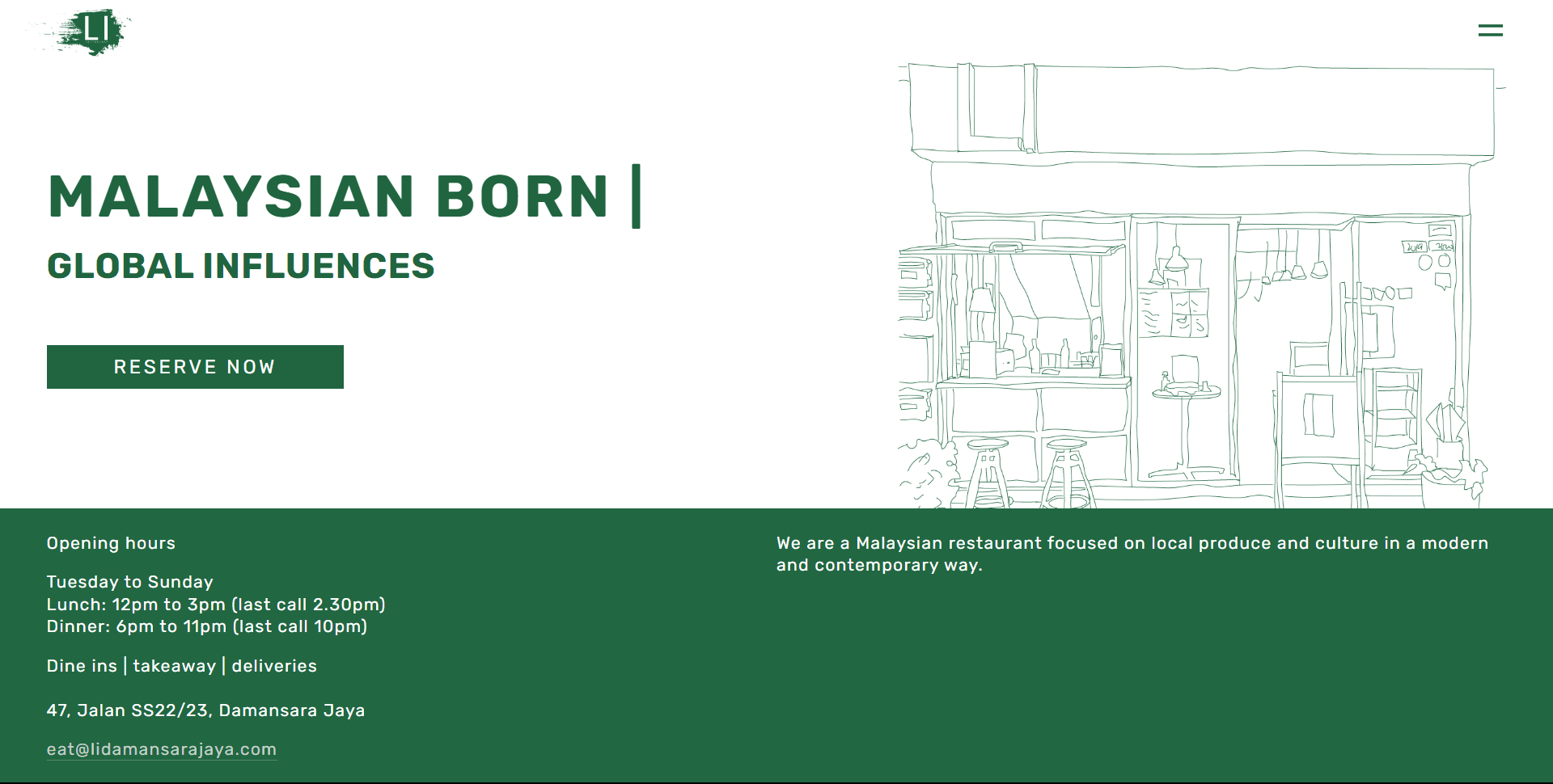
Li’s landing page that doesn’t show a clear purpose or relation to food
The clashes of multiple design systems due to the use of multiple third party apps
Li uses 2 third party apps to outsource a food delivery service and a booking system. Therefore each app has their own design systems which clashes with Li’s brand image and inhibits their branding.
The website only uses their primary colour of dark green and white which is consistently used throughout the website but it isn’t effective in emphasizing their intended message to help guide the user.
The website isn’t fully integrated and cohesive with one another
The main service of a restaurant is to showcase the food and service, but Li’s website doesn’t have a strong emphasis on this aspect. They have a menu in pdf format, which contains no pictures as well as looks dull. The use of the external food delivery system has provided assistance to this issue but it lacks the Li branding.
Goal
Mobile Mockups
Early Ideation
I started by drawing out different layouts for the updated responsive website starting with the mobile version.

Different variations of mobile wireframe sketches for the redesigned project
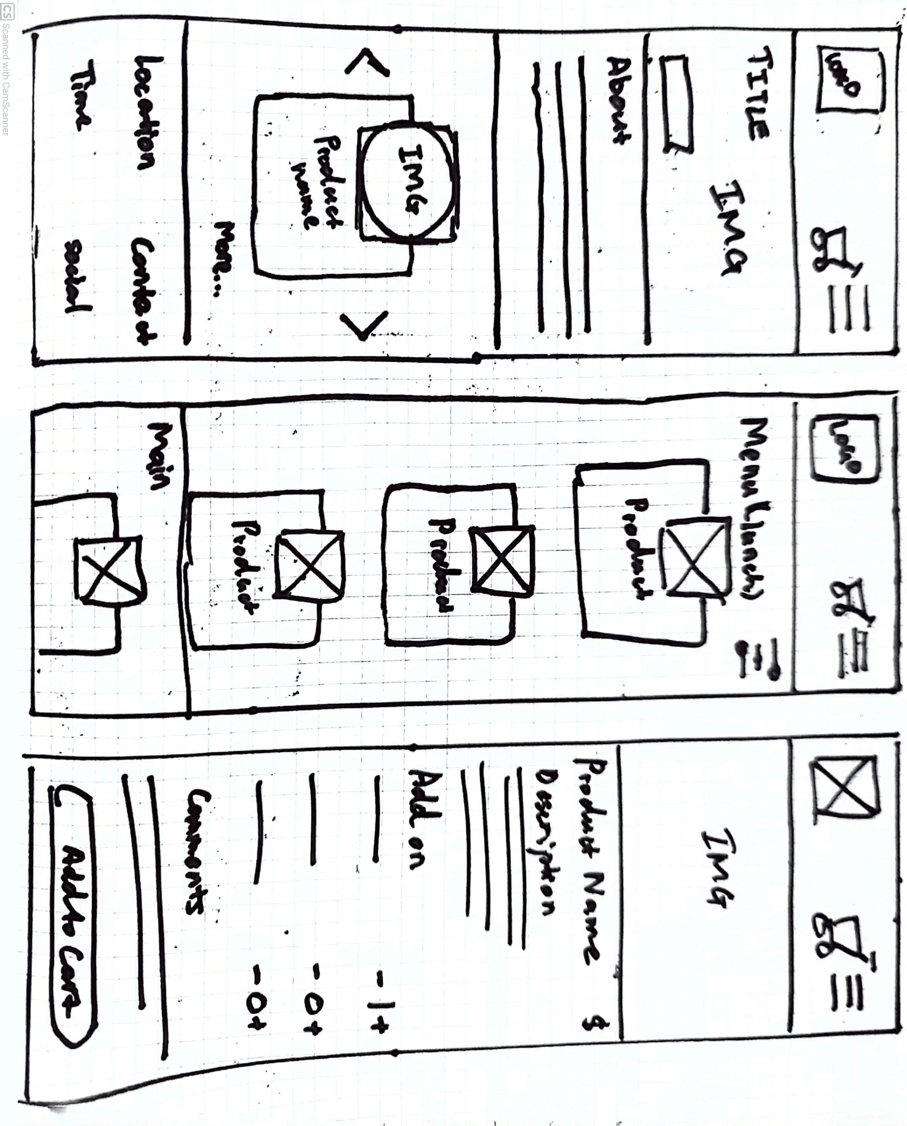
More sketches of the mobile homepage, menu page and product page
After getting a few variations of the layout and user flows, I proceeded to work on the colour palette. This was done by playing with the different colour theories such as monochromatic, analogous and complementary. There were variations that included Li’s primary green as well as different experimental colours that were way different from their green. The goal was to choose a design that still resembles the brand while enhancing it via complementary colours and layouts. Overall it landed on an analogous green colour scheme.
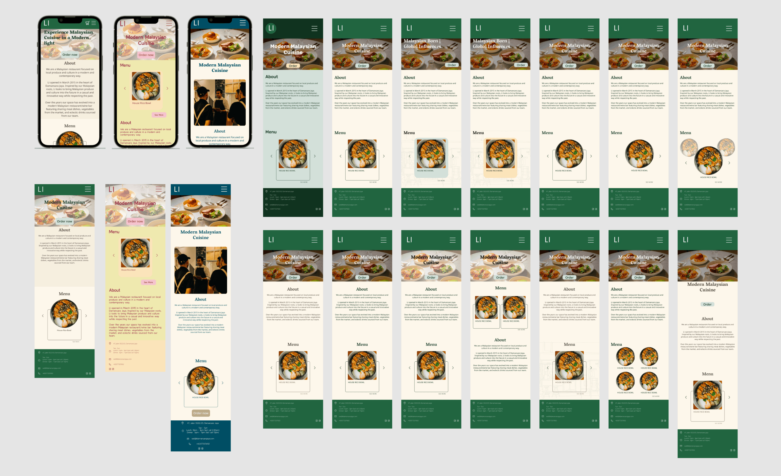
Variations of the mobile design page, with the 3 most radical ones on the left
I also designed a few variations of the user journey to find the optimal way a user would navigate the website. In doing so, I leaned towards using icons, button styles and typical CTA locations to allow external consistencies with other websites. This would allow users to have more familiarity with traversing the website.

Website inspiration that describes external consistencies of starting the user journeys.
For the menu, I liked the aesthetic of menu cards and had a few variations of them. The problem I faced during the menu design would be a way to make the menu items be easy to grasp the information and to not make a never ending list due to the number of menu items Li has. Cards group the information of a dish and allows it to be displayed in a grid format which was great as it allowed me to control how many items per row and columns.
Final Designs
The final design was chosen with the hero section leading the landing page to showcase a hero image of Li’s food as well as a call to action allowing users to begin ordering their food straight off the landing page.

The redesigned landing page, with a CTA on the Hero Section

A simplified version of the user flow for the redesigned website
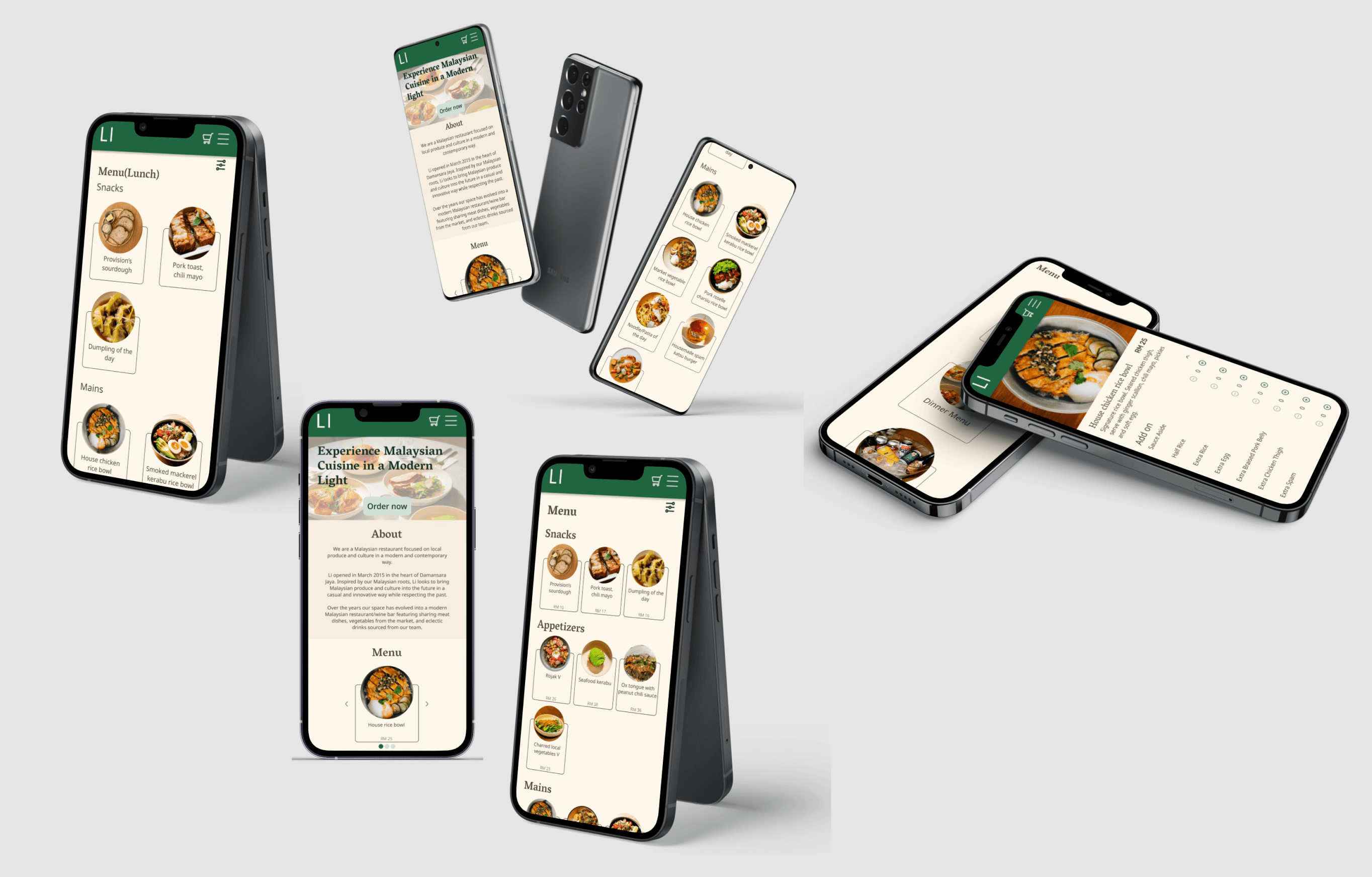
Here are some of the designs in action as they are presented via mockups:
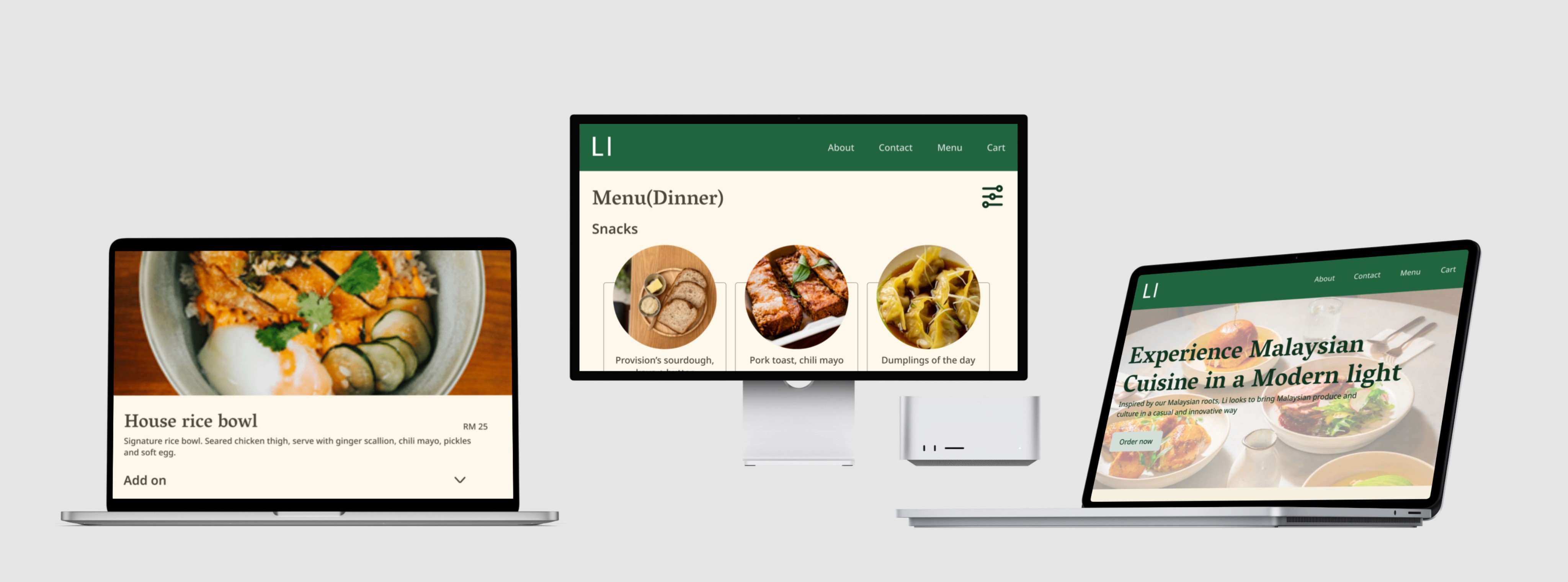
Desktop Mockups
The UI Kit for the designs were based off the analogous dark green colour scheme. The typefaces that were chosen for this project were Vesper Libre (Headings) and Noto Sans (Body Text).

UI Kit for both mobile and desktop versions of the redesigned websites
Here are some of the interactive components used for this project:

Components used in the desktop version of the website
User Testing
After the design was completed, I conducted remote testing of my final prototype design. I compiled the feedback from the participants and these were the results:
Users couldn’t increase the number of products that were added to cart, and needed to do the whole process again to add another one
Users had too many items in the menu as the list of products were very long
Users were not issued with an order number after completing their order
Users didn’t have any space to input their address for their delivery order
Development
The designs were then developed via HTML, CSS and Javascript.
Github repository: https://github.com/weikaikhoo/UIDev-A3
Github website: https://weikaikhoo.github.io/UIDev-A3/
During development there were certain design elements that needed to be change in order to enhance the user experience based on the conclusions of the user testing.
Base font size has been reduced from 20px to 16px during development to adhere to industry standards
Words within components were replaced with icons or better alternatives that differentiated them with other generic terminology
The size of the product image was reduced to keep the resolution from decreasing on larger screens
The order page now includes a contact details form to gather customer information and delivery addresses from the customers
The confirmation page shows a receipt of the order as well as an order number for better referencing for the restaurant and user
About
Contact
Menu
Cart
47, Jalan SS22/23, Damansara Jaya
Tue - Sun
Lunch: 12pm - 3pm (last call 2.30pm)
Dinner: 6pm - 11pm (last call 10pm)
eat@lidamansarajaya.com
+60377337692
Comments
Add to cart
Add on
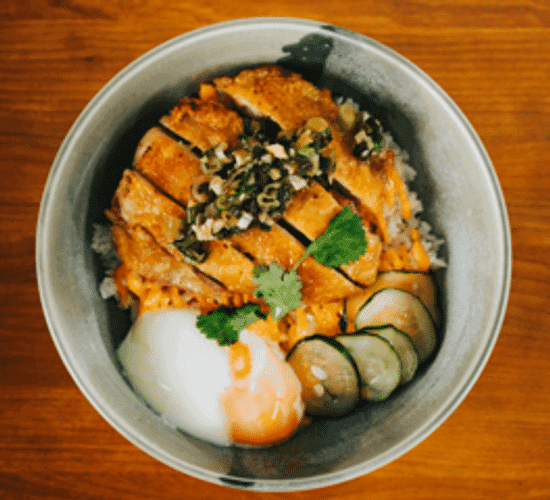
House rice bowl
RM 25
Signature rice bowl. Seared chicken thigh, serve with ginger scallion, chili mayo, pickles and soft egg.

Product page design was changed during implementation so that the product image wasn’t stretched and image quality is retained

About
Contact
Menu
Cart
3
47, Jalan SS22/23, Damansara Jaya
Tue - Sun
Lunch: 12pm - 3pm (last call 2.30pm)
Dinner: 6pm - 11pm (last call 10pm)
eat@lidamansarajaya.com
+60377337692
Order Summary
House Rice bowl
RM 25

Spam Katsu Burger
RM 29

Panna cotta
RM 20
Total
RM 74
Checkout
Payment
Credit/Debit card
PayPal
GooglePay
Takeaway
Delivery

Cart page design after implementation, was changed to collect customer details for the order
About
Contact
Menu
Cart
47, Jalan SS22/23, Damansara Jaya
Tue - Sun
Lunch: 12pm - 3pm (last call 2.30pm)
Dinner: 6pm - 11pm (last call 10pm)
eat@lidamansarajaya.com
+60377337692
Your order has been confirmed.
We will notify you when the food is ready.
Thank you and have a nice day
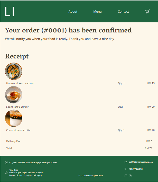
Design after implementation was changed to provide useful information
Future Steps
The future improvements would be to quality check the functionality of the UI design before implementing as I did multiple changes to the design during development. This can be done in the project because I’m the designer and developer but in the future, I may only be one of those roles that I can’t change the design without any authoritative procedure.
Make the website design simple with high functionality and animation rather than a complex aesthetic design that has decent functionality and animation
Double-check the website on the typical screen size as I’ve been using larger screens which mess with the measurements when I’m designing it.
Make a plan before developing to code all HTML of all pages first rather than completing one page at a time as the CSS affects all pages so it’s easier to view when everything is already set up