

Client
Dinya Designs is a shopfitting store that wanted a redesigned website that was more suitable to the current times, and would include a more immersive experience while traversing the website.
*The design work was done by my Senior UI Designer, I was in charge of converting designs to mobile

UX Analysis
The legibility of content on the homepage
The colour contrast on the homepage doesn’t meet the WCAG standards. Key information on the navigation bar cannot even be read without squinting your eyes.
The visual hierarchy of content is lacking
The text on the right of the hero section doesn’t provide the right hierarchy and there are too many font sizes and weights that make it quite jarring to look at.
Dull filter options in the product listing page
The product listing page isn’t very intuitive when it comes to filtering out the kinds of features you would want in the product.

The old product listing page

The old hero section of the homepage
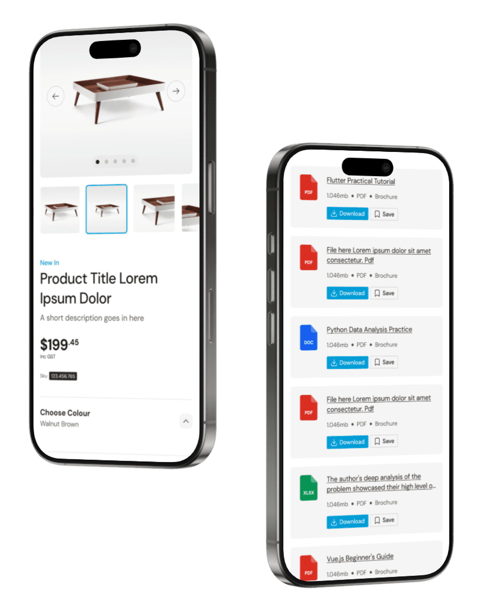
Final Designs
The visual designed was aimed to have a cleaner and more minimalistic aesthetic. Picking up certain comfortable picks that users have already used from popular brands such as IKEA. Designs were adapted to fit the mobile screen, with some alterations to fit the smaller screen size.
This meant:
Flipping the orientation of certain content from horizontal to vertical
Creating carousels to scroll through different images


Learning Outcomes
Designing with mobile in mind increases efficiency
After learning the design system my Senior UI Designer created for the project, I understood why components were created. The design system of creating components that didn’t need to be changed as much when transitioning from desktop to mobile. This made my job much easier and had got me thinking to do the same in the future.
How to manage a budget
After being told to count my hours, I’m more conscious on counting my hours and managing my time for the project in regards to research, wireframing and designing.

